Designing Mobile App helps Solo Travellers to plan a Journey Start to End
My role
Product Designer
Platform
iOS Based
Product
Drimingo
Year
2024
Project Overview
Picture this, You're a solo traveler landing in Sri Lanka. You've spent weeks researching across a dozen blogs, saved 50+ Instagram posts, and downloaded four different apps. But when you actually need information standing at a bus station with spotty WiFi nothing works. The "hidden gems" you found? Overcrowded tourist traps.
This was the recurring story my client heard from over 100 of guests at his Airbnb properties. He saw an opportunity: What if there was one app designed specifically for independent travelers, combining AI-powered planning with authentic local experiences that actually work offline? That's how Drimingo was born.
The Real Problem
Connected Information
Travel information was scattered everywhere. Travelers averaged 15-20 hours of research across 5-7 platforms, then screenshot everything or saved in several places because nothing was connected.
Offline Capability
Without local SIM cards and with unreliable WiFi, travelers were left stranded at critical moments. Solo travelers don't need more information, they need the right information, curated for independence, accessible without connectivity, and trustworthy enough to rely on.
Authentic Experiences
Mainstream apps optimize for tourist volume, not authentic experiences. They want to discover things like hidden local cafes and food spots, neighborhood markets and simple workshops, cultural events, festivals, or street performances, natural trails, waterfalls, or village walks known mostly by locals, and volunteer or learning opportunities, not another crowded temples.
Approach - Lean & Strategic
We had 6 months, MVP budget, no direct competitors to benchmark against, and limited research resources. So we got strategic. 3 key decisions shaped everything.
- Start Small to Test - We limited the initial version target only to iOS and selected Sri Lanka as the pilot destination to build the database structure. We planned to master Sri Lanka perfectly (450+ curated experiences) before expanding.
- Offline-first Design - Let users to download selected location data and experience data then core features work without internet. When they back online, enhances the experience.
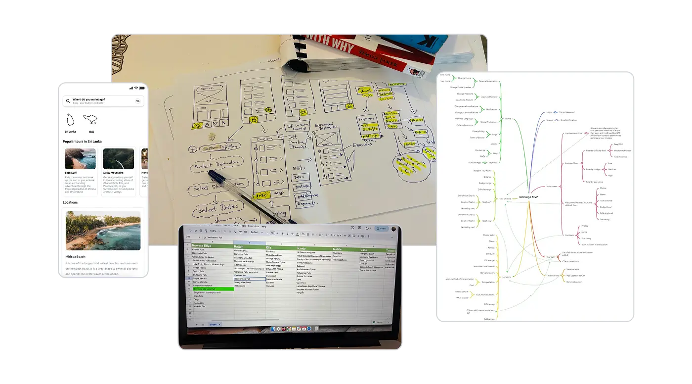
- Rapid Iteration - Lean - We skipped wireframes entirely, moving straight to high-fidelity prototypes and used existing brand guidelines to build simple design system.
Lean UX is a collaborative, agile-inspired approach to designing user experiences that not mainly focus on heavy documentation and deliverables, but rapid feedback cycles and iterative learning. It focus on cross-functional teamwork and experimentation. Forming hypotheses from assumptions, building quick prototypes or MVPs, then testing and refining repeatedly to shape the product efficiently.
The Solution
Based on the findings, the team has resolved to prioritize three core features as the MVP.
Curated Local Database
We built a database of 450+ experiences in Sri Lanka, not just landmarks, but the workshops, neighborhood breakfast spots, and village walks that only locals know. Each tagged with 30+ attributes like, duration, cost, difficulty, safety rating.
AI-Powered Trip Planning
Users input their dates, interests, and place. The AI generates a logical route that balances variety (culture + nature + food), and schedules activities at optimal times (sunrise hikes, evening cultural events). Users can then customize freely.
Offline-First Architecture
Complete destination guides, saved itineraries, and offline maps can download into the app when they've access to internet. No WiFi or mobile data required to access the downloaded content later when traveling.
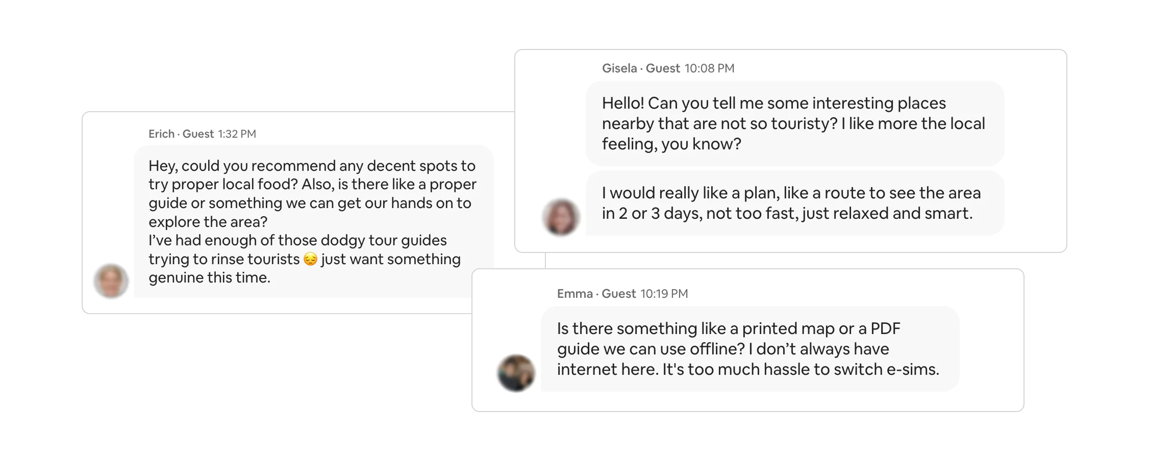
The Journey - Learn & Iterate
Prototype 01 - The Reality Check
- What we tested: Basic AI trip creation with limited interactions.
- What broke: 6 out of 10 users couldn't figure out how to add specific experiences to their trip. Navigation felt disconnected. AI suggestions seemed "generic."
- What we changed: Redesigned the entire "Add to Trip" flow, added personalization explanations. Created unified save/bookmark actions.
Prototype 02 - Getting Warmer
- What improved: Trip creation task completion jumped from 40% to 90%. Users loved the AI suggestions. We trained the AI with collected database.
- What still broke: Only 2 out of 10 users discovered the offline download feature organically. Multi-day views felt cluttered.
- What we changed: Made offline downloads prominent with onboarding hints, introduced collapsible day views, added map overviews for route visualization.
Basic Database Structure
Prototype 03 - The Validation
- The results: 8 out of 10 users completed all tasks successfully. Time to create first trip dropped from 12 mins to 6 mins. Satisfaction score climbed from 6.1 to 8.2 out of 10.
- What next: Identify opportunities to leverage existing mature services (e.g. API integration). Benchmarking with non-direct competitor travel platforms.
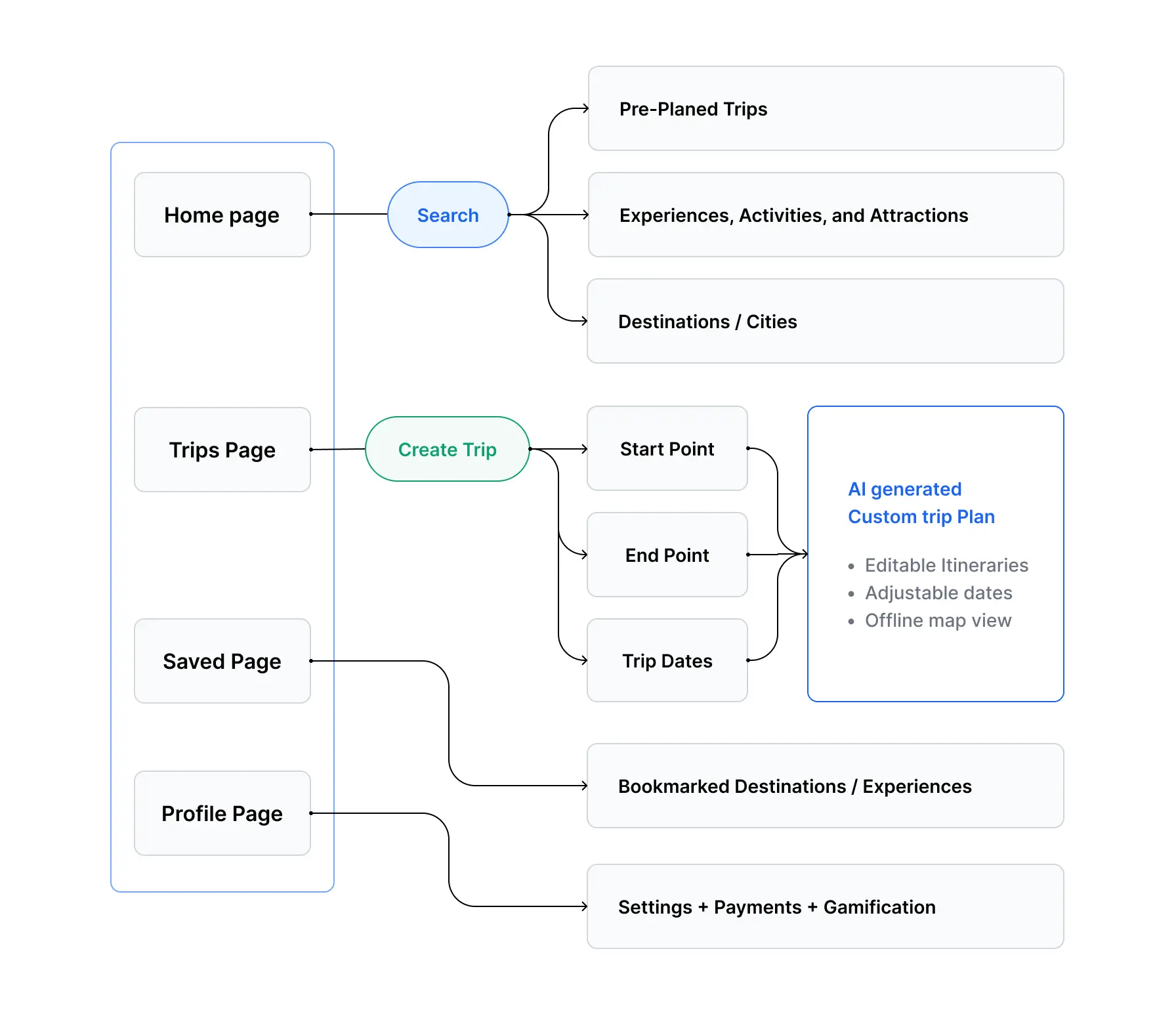
Beta 3.0 User Flow
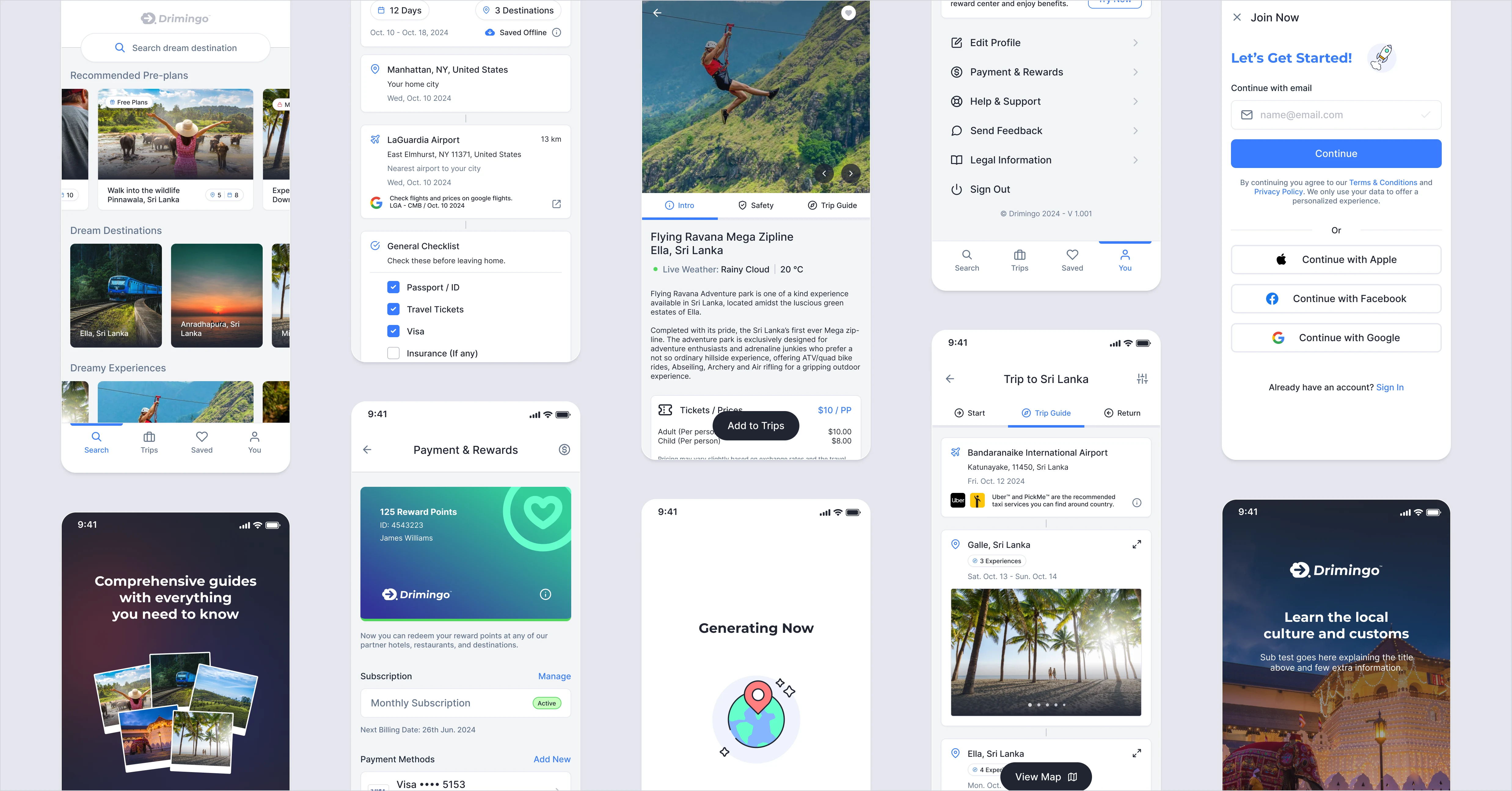
Final Experience - Beta 3.0
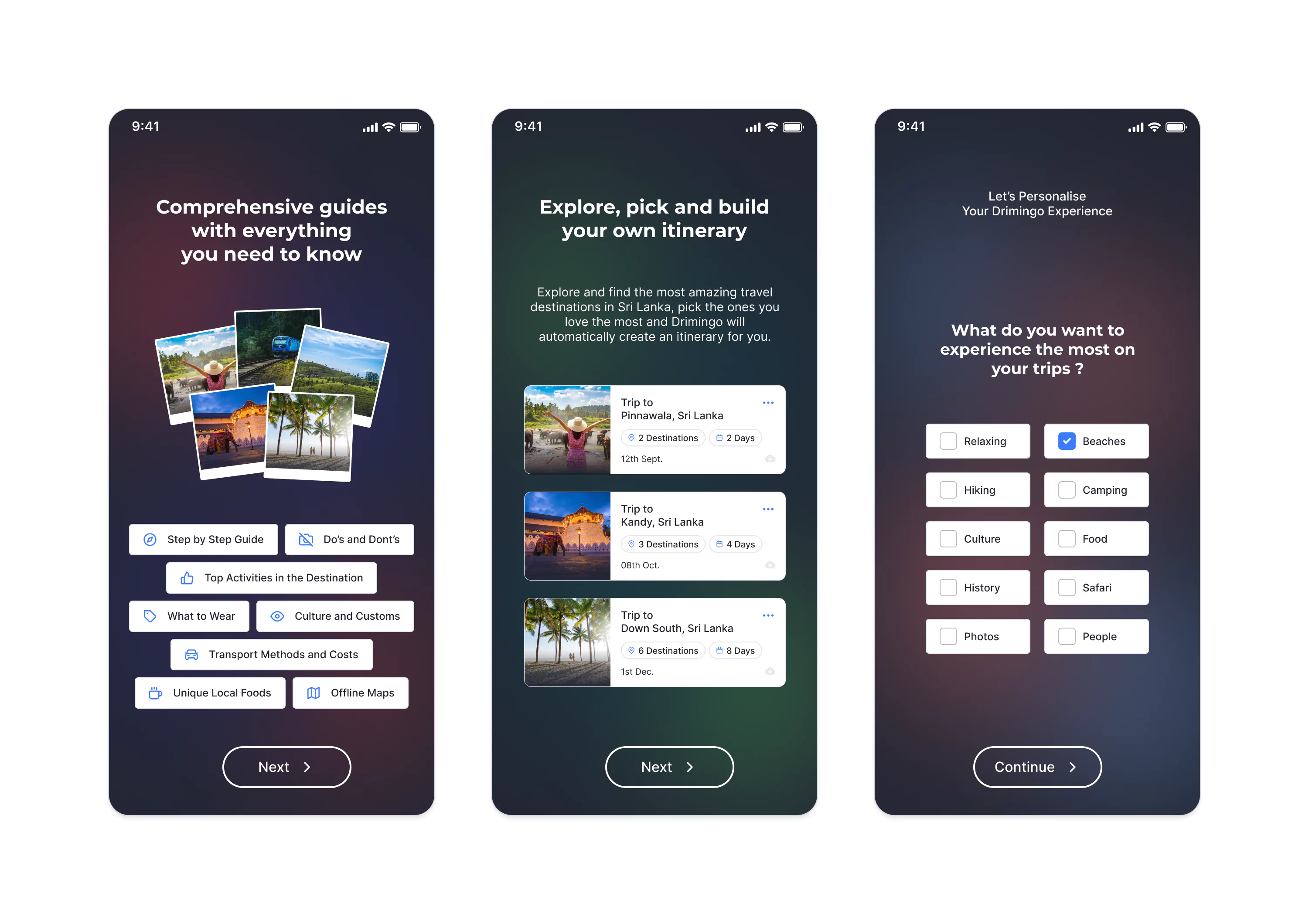
Onboarding & Personalisation
Customers will receive a brief guide on the onboarding screens. There are two levels of onboarding, in the second level, user input will define the initial recommendations.
Users have the option to register as free members or browse the content as guest users. However, to access more detailed information, users must sign up for a free membership.
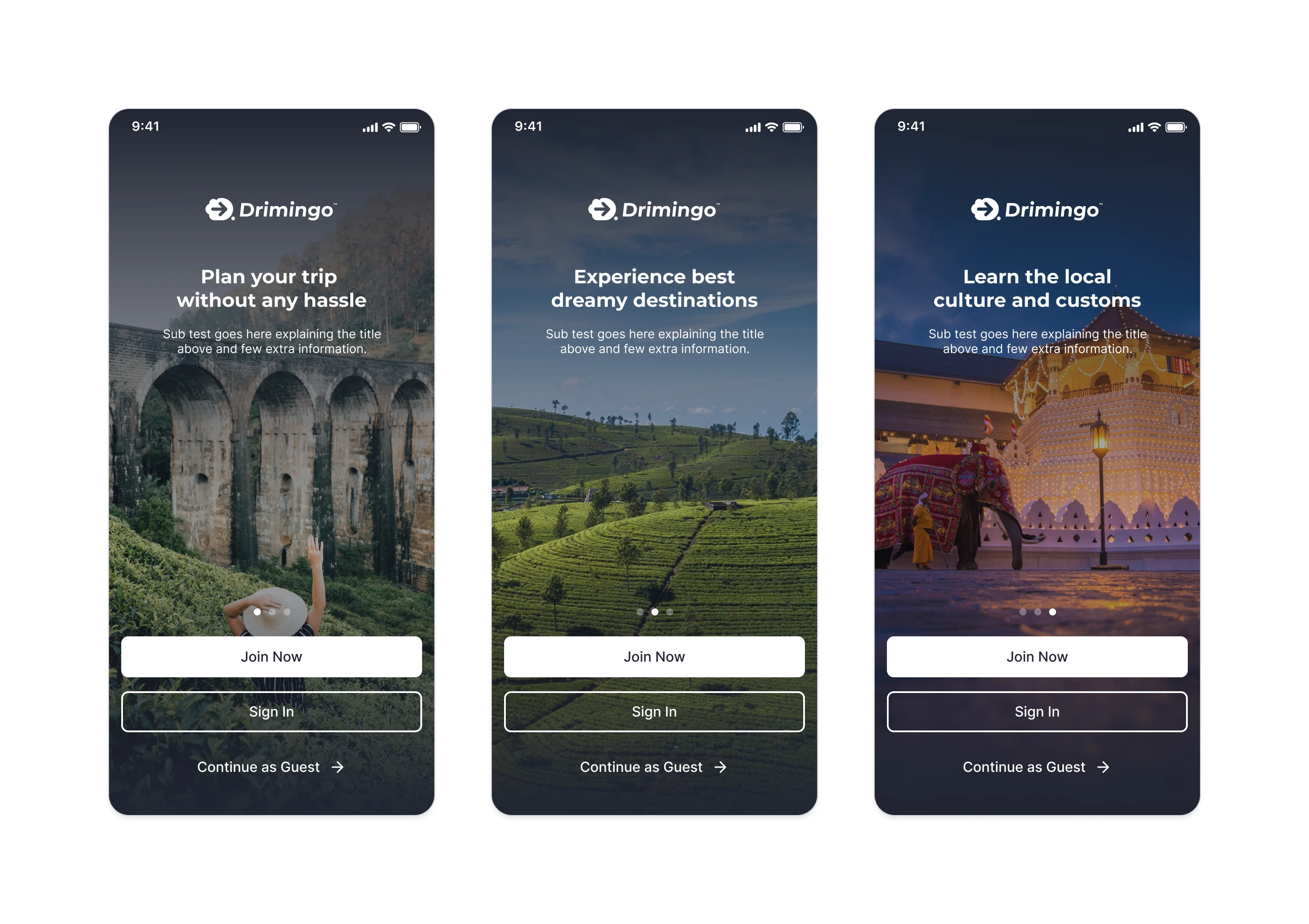
User Onboarding / Level 01
User Onboarding / Level 02
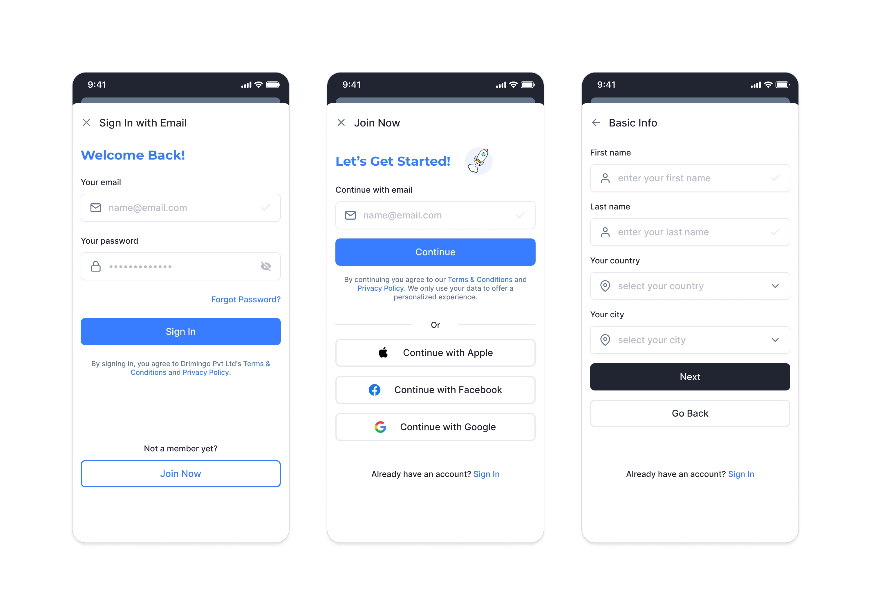
User login / User Signup
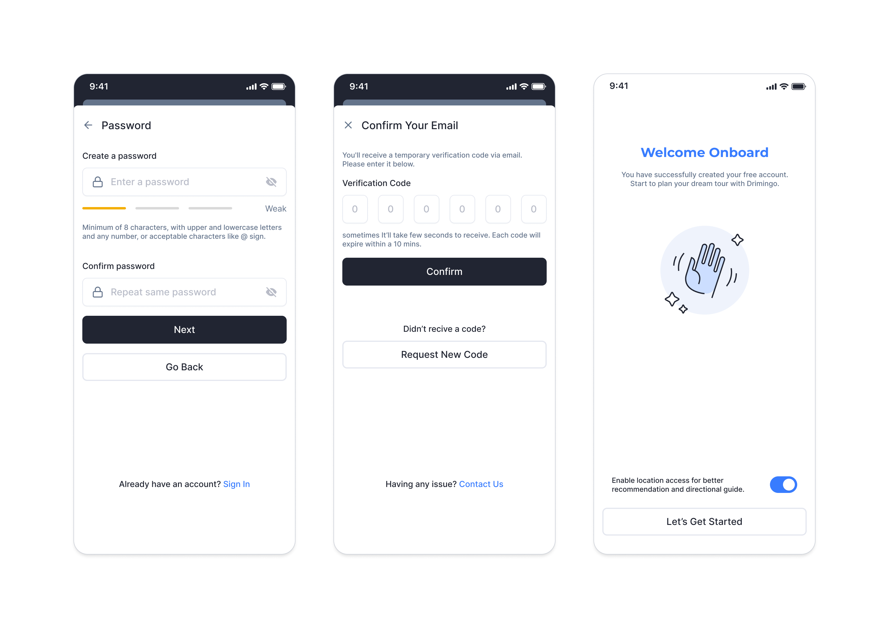
Password Guide / OTP verification
Home & Search
The upper section of the home screen will showcase a carousel featuring the most recommended and sponsored destinations. As users scroll up, they will encounter pre-planned trips, curated destination suggestions, and unique experiences.
Search results will be categorised into three distinct groups based on the entered keywords. Additionally, users will have the option to refine their search using various filtering parameters.
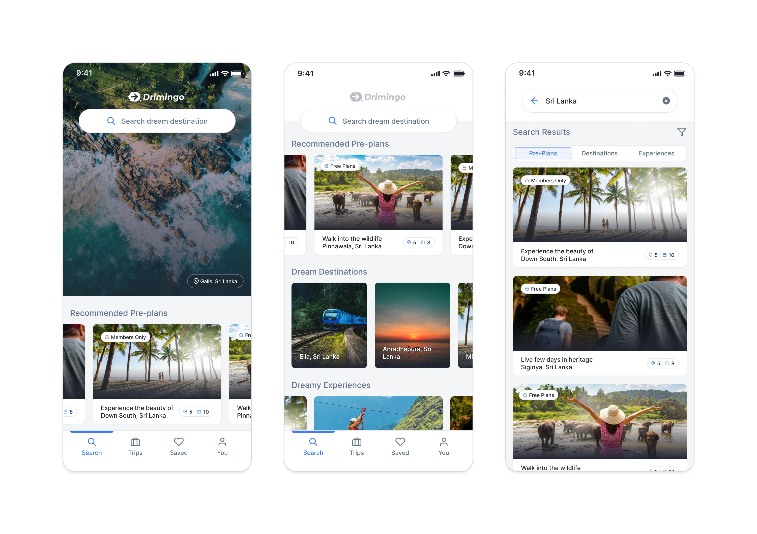
Home Screen / Search Results
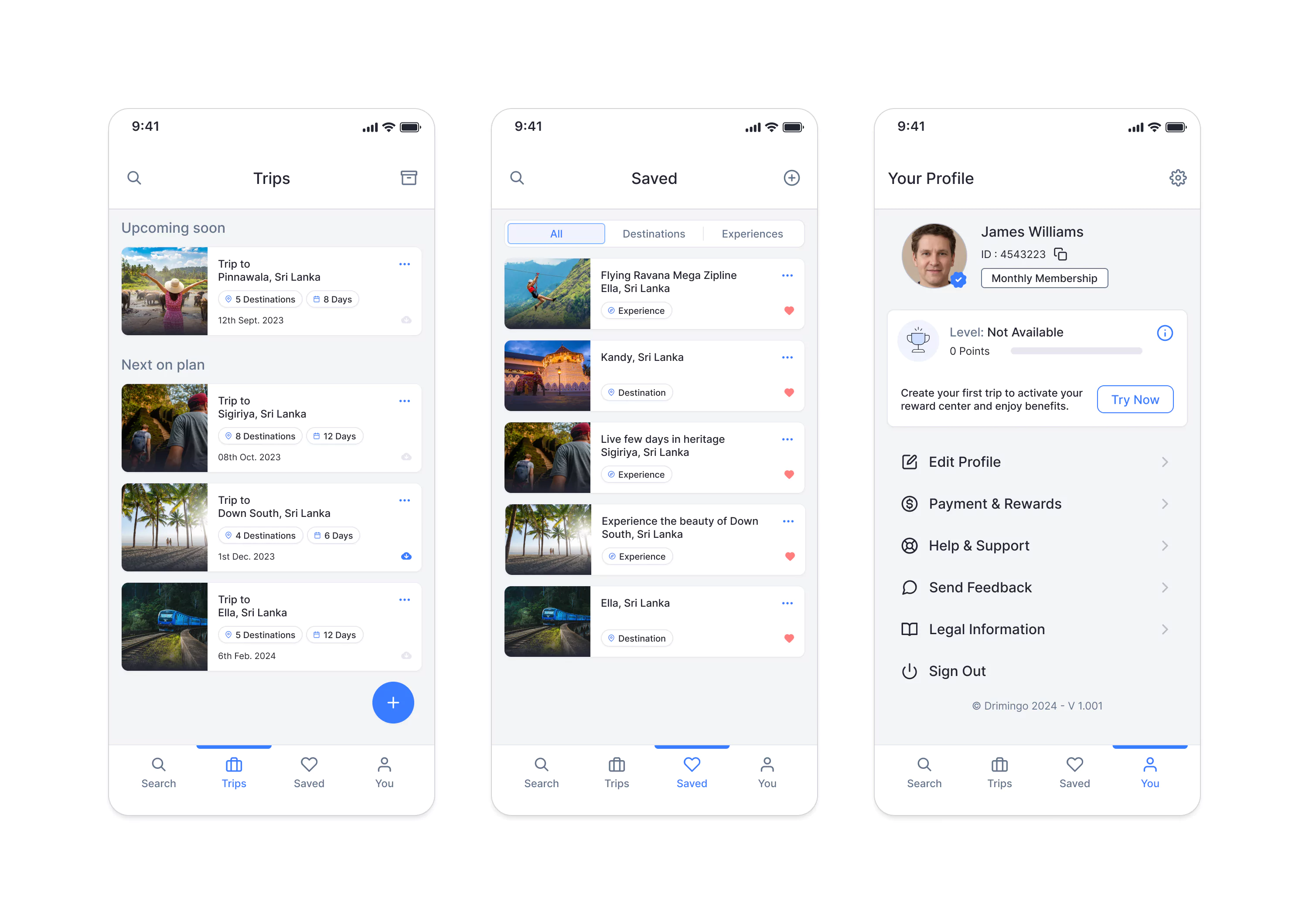
Created Trips / Saved Itineraries / Profile Settings
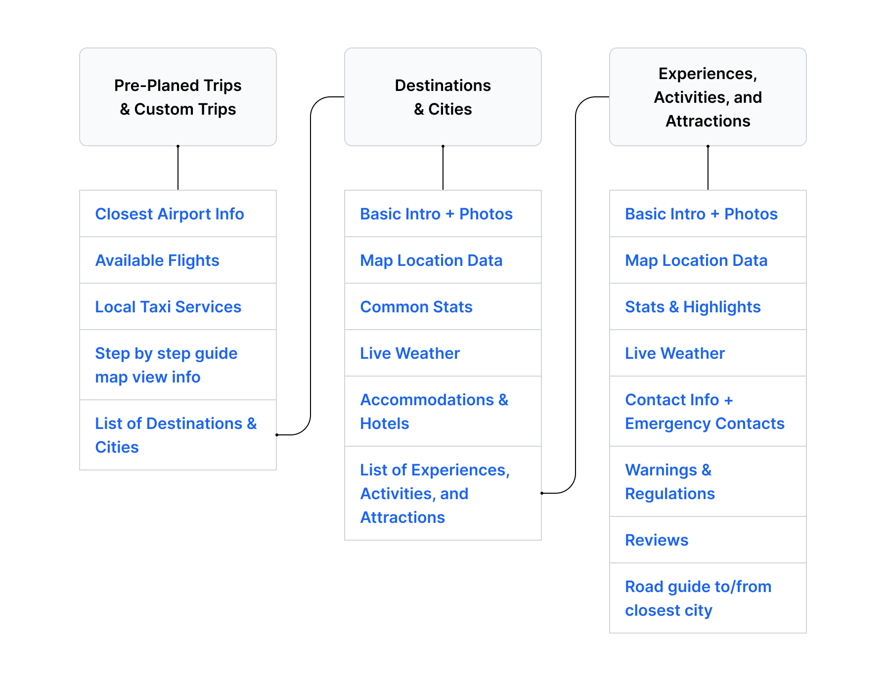
Destination Discovery
Destination pages are basically cities, while experience pages are attractions and activities available in those locations. Users have the ability to save/bookmark any destinations or experiences for their upcoming trips. Or they able to directly add them to an existing trip plan.
Experience pages will offer comprehensive guides, including essential do's and don'ts, user reviews, ticketing links, weather information, and other vital details that travellers require.
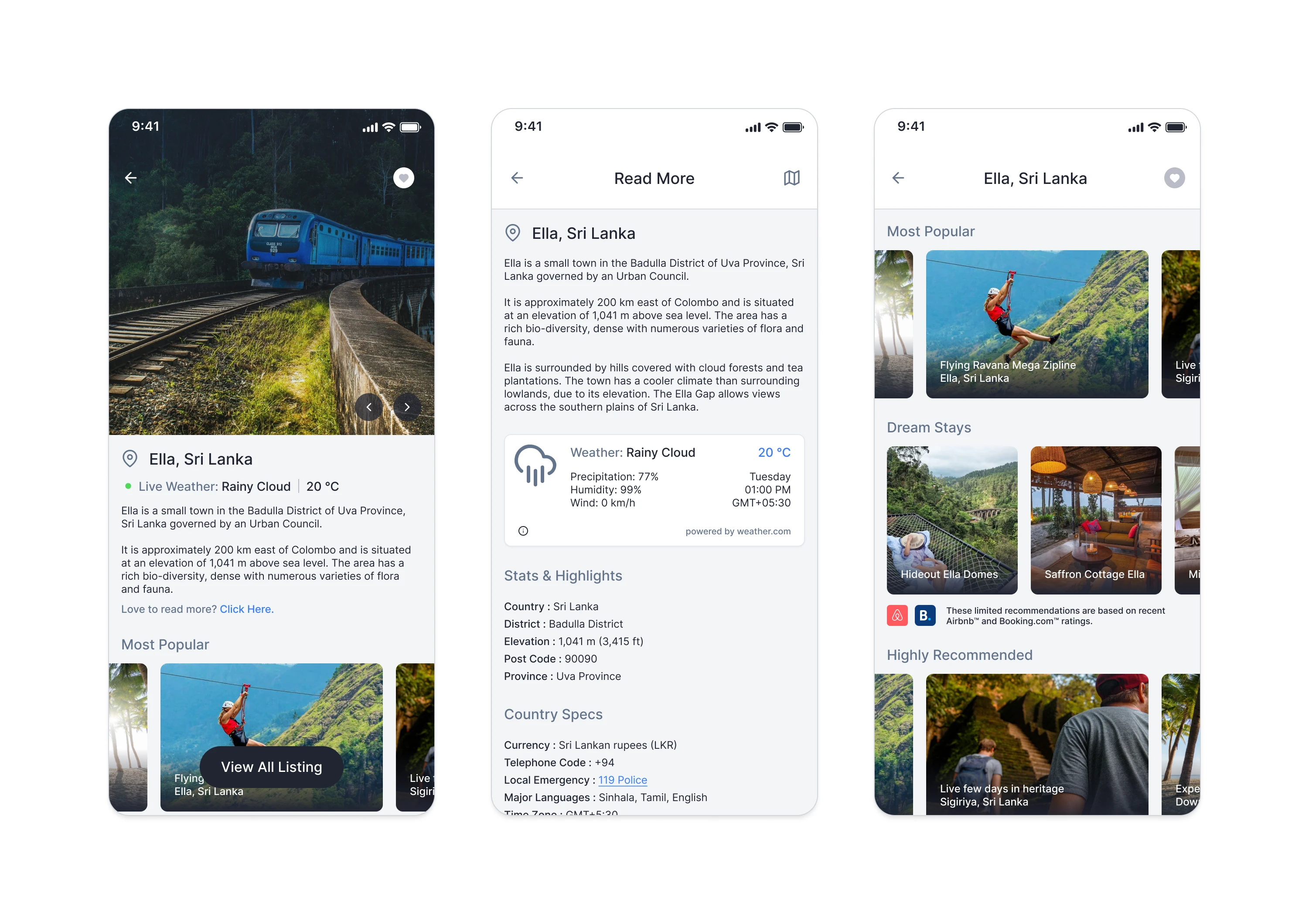
Destination Intro / Experiences Listing
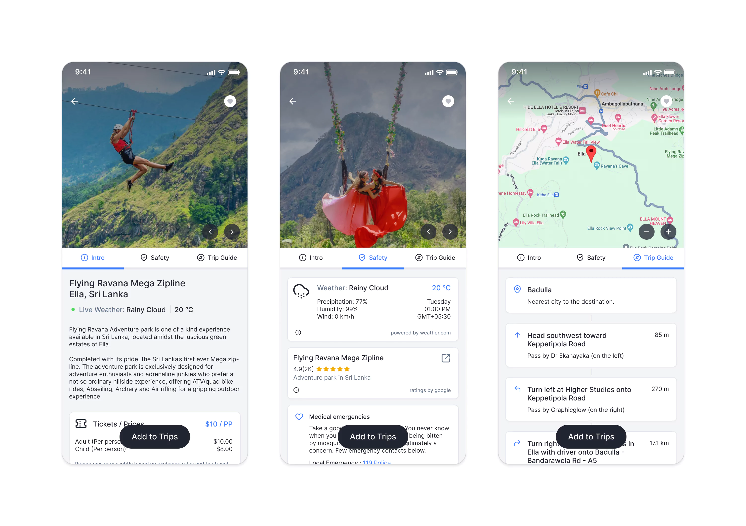
Experience Details / Trip and Safety Guide
AI-based Trip Planning
Each trip plan is designed around a single country for this initial version. If users wish to travel to more than one country during a single trip, they can easily create multiple trip plans. In future versions, we aim to introduce multi-country trip plans.
Users can simply input their starting locations, destinations, travel dates, and the number of travellers. With the support of AI and our extensive database, users will receive a customised round trip itinerary.
We have linked third-party service providers to offer services such as air ticketing and taxi arrangements. The trip checklist will provide users with a list of essential items to pack based on their chosen destinations.
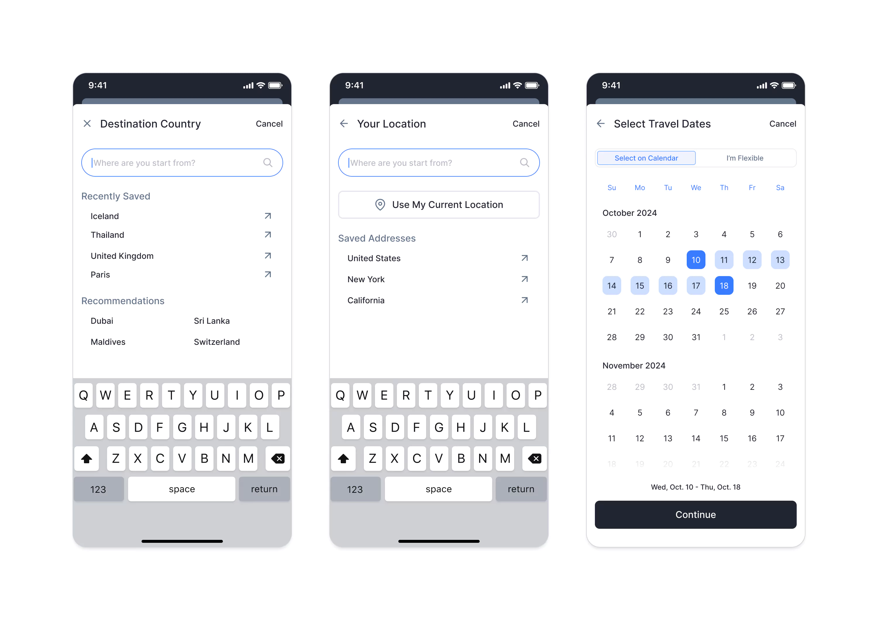
Destination / Your Location / Dates
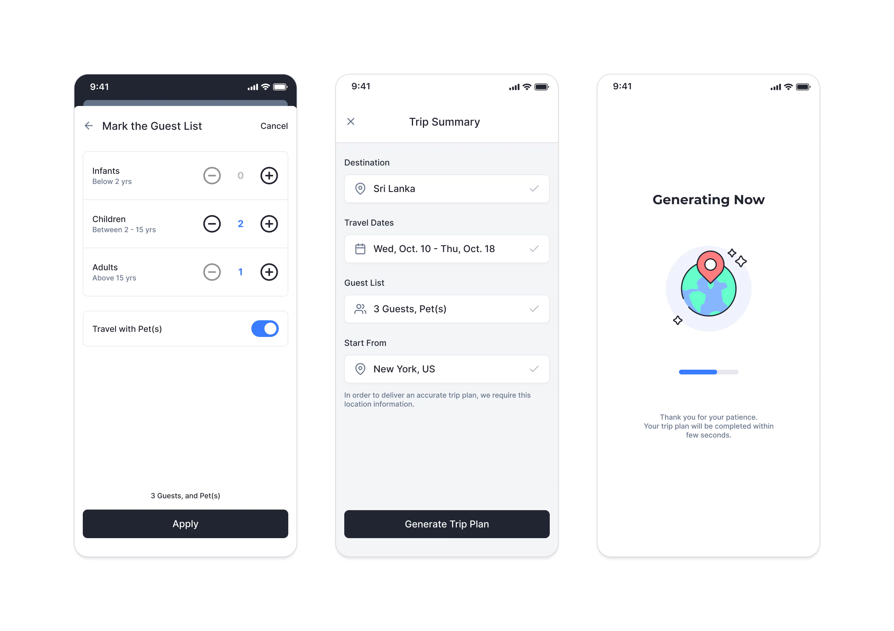
Travellers Count / Selection Summary
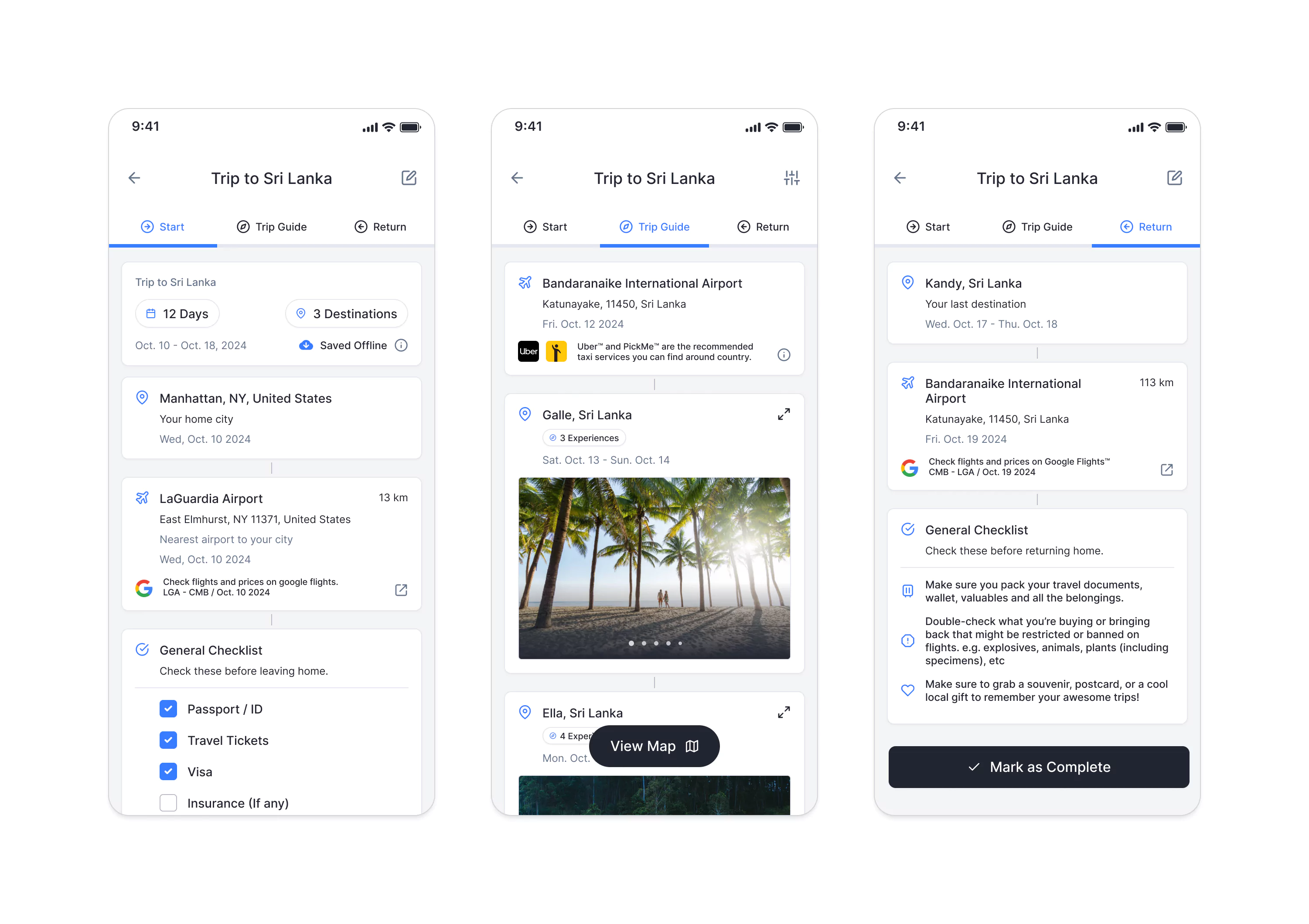
Trip Plan Flow / Step by Step Guide

Expand each Destination / Map View / Edit Parameters
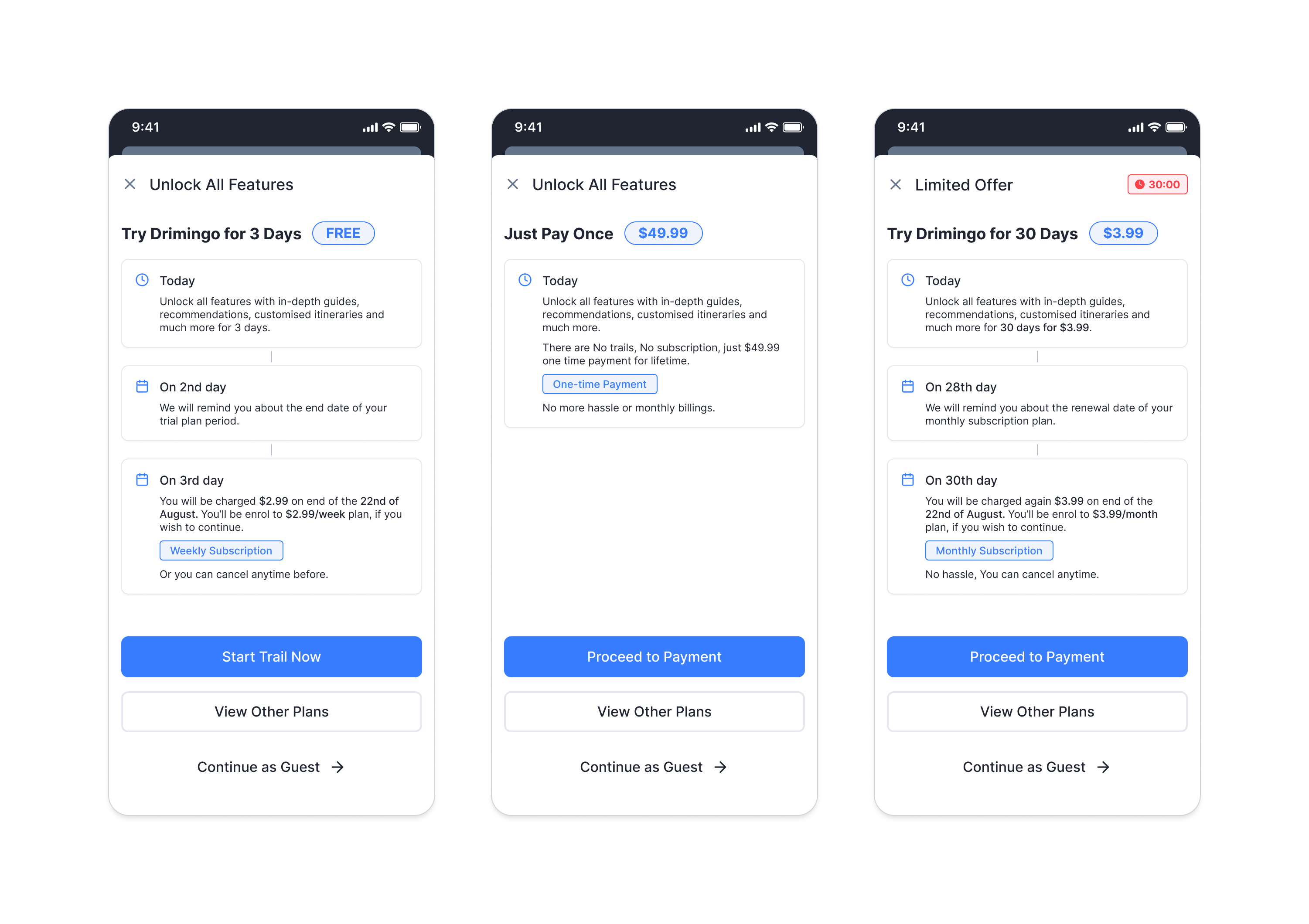
Payments & Gamification
Defining a pricing model requires extensive research; otherwise, users may disengage before considering payment for the service. Based on the research data, the initial pricing plan proposed by the client as screen below.
To highlight the benefits, we allow users to explore the content as guest user and offer a free membership to experience the service from start to finish. Payments will be processed through Apple Pay™ and PayPal™, with plans to integrate PCI compliance into the system at a later stage.
A point collection system has been introduced as part of our gamification strategy to enhance user interaction, allowing users to redeem these points for discounts at our partner hotels and attractions.
Different Membership Plans

Select Payment Method / Add New Card / Payment Receipt
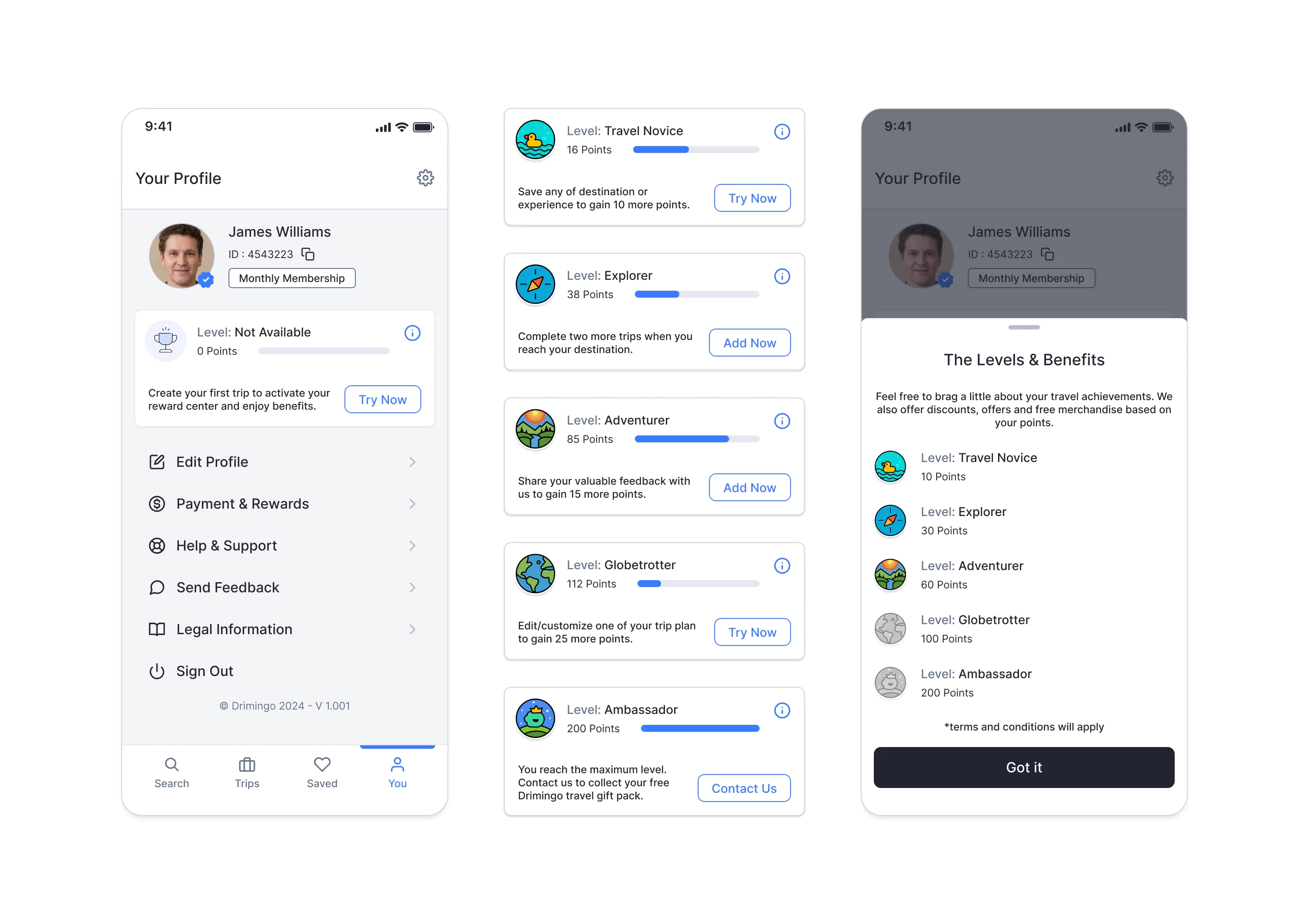
Gamification / User Levels
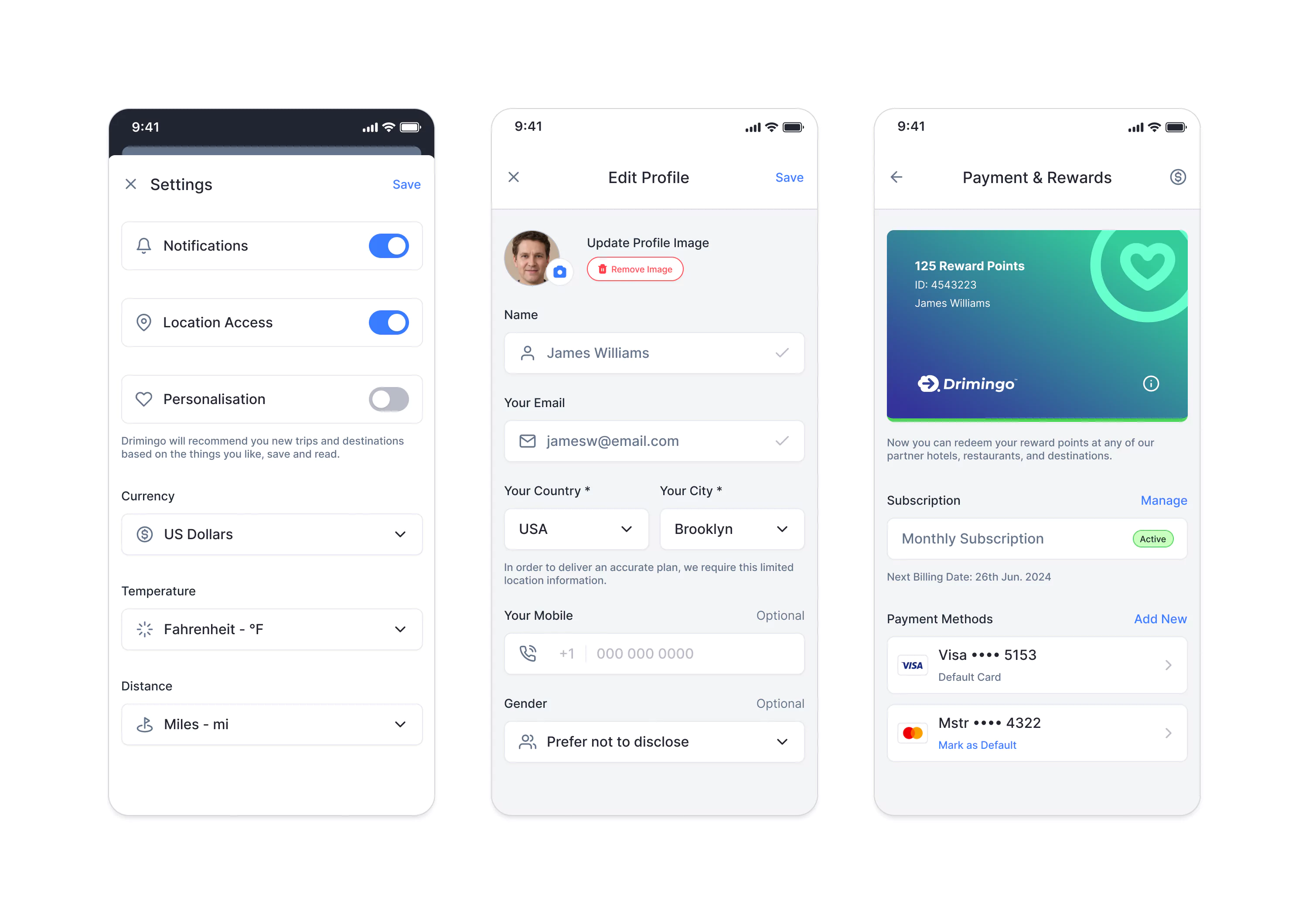
User Settings / Reward Card / Membership Info
Key Design Decisions
Why This Information Architecture?
Initially, we structured everything around destinations (cities) with experiences nested inside. Testing revealed users actually searched for activities first "surfing" or "tea plantations" not cities.
The fix - Parallel pathways. Users can explore by destination OR experience type. Search returns both, clearly categorized.
Why Gamification?
We explored social features (share trips, follow friends) and badge collection, but solo travelers told us they weren't interested. Points with tangible rewards worked because they offered real values, discounts at partner hotels and attractions.
The fix - Earn points for planning (5 per trip) and actual travel (50 per check-in). Redeem at 200, 500, or 1000 points. But only around 20% of users engaged with this feature. It needs rethinking.
Why This Pricing Model?
We allow guest browsing and free membership to let users experience the full value before asking for payment. Premium unlocks unlimited trips, advanced AI features, and exclusive experiences.
Need to fix - 62% of users abandon apps within one to two months after downloading. We're now A/B testing monthly subscriptions and one time payment plans.
What We Learned
Success Factors
- Skipping wireframes felt risky but worked because we had simple design system and committed to rapid iteration. UX processes should serve the project, not the other way around.
- 71% of users created at least one trip on beta testing. More than 60% positive feedback on AI itinerary feature and offline download capability.
- We leveraged the client's guest relationships for quick feedback. No project is perfect, so we focused on extracting maximum insights from what we had.
- We successfully tested and refined three iterations of the design over a period of 6 months.
- Client reached and secured few investors based on MVP traction. Phase 2 development will start with few other asian countries.
What Didn't Work
- On average, about 62% of users abandon apps within one to two months after downloading.
- Multi-country planning wasn't available but was highly requested on feedback sessions.
- If I could restart, I'd push for 5-7 formal user interviews before any design. Informal feedback helped but lacked depth on the "why" behind behaviors.
- Database maintenance costs and AI tools costs ran 30% higher than estimated.
- A new pricing model needs to be A/B tested to target the initial activation period to generate a steady revenue.