Upgrading to a Tailwind-Based Design System: From Chaos to Consistency
My role
Product Designer
Platform
Web Based
Product
SocialCatfish
Year
2025

Project Overview
As our product and team grew, we began to notice the cracks in our original design system. Pages became harder to maintain, performance dropped, and collaboration between designers and developers became more challenging. We needed a solution that could scale with our fast-paced environment and keep everyone aligned. This is the process of how switching to a Tailwind-based design system brought clarity, speed, and consistency to our work.
Tailwind CSS is a utility-first CSS framework. It provides a large collection of tiny CSS classes that developers can combine to quickly and consistently build custom designs. Instead of writing custom CSS, you use these pre-defined classes to style elements directly within your HTML.
Issues we faced
Before Tailwind integration, our website build from scratch with basic CSS, and custom components but later on we faced multiple growing pains with the team expansion.
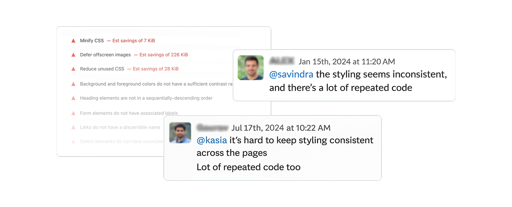
Inconsistent UI elements
Similar components looked different across pages.
Duplicated styles
Repeated code slowed down the site and introduced errors.
Scaling issues
Adding new features risked breaking existing layouts.
Missing interactions
Some basic UI behaviors, like button hover, focus were missing.
Quick-fix mindset
The original system was built to make things deliver fast but not to last.
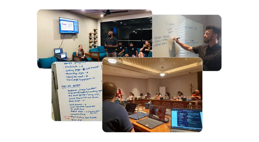
Research & Insights
We began by assessing the situation through UI audit, code reviews, interviews, Internal survey, group ideation sessions, tool analysis and comparisons.
- Revealed inconsistent patterns and unnecessary complexity in stylings.
- Revealed front-end custom codes doesn't follow most of industry standards.
- Developers found the system hard to maintain due to lack of documentation.
- New developers noted that lack of structured onboarding process slows adaptation.
- Tailwind stood out in our research for its simplicity, performance, and flexibility.
The Solution
Based on our research and insights, we have concluded that adopting a Tailwind-based system will help us eliminate the complexity of our original frontend code. At the same time, this approach will enable us to adhere to industry standards and WCAG (Accessibility) guidelines.
Aside from that, a utility-first CSS project is easier to manage than a large CSS codebase, as HTML is simpler to work with. Companies like GitHub, Netflix, Segment and Twitch successfully use this approach.
Additionally, we will develop a front-end component library that will make the onboarding process much easier for developers. We will also conduct a series of design-to-code sessions, live walkthroughs, workshops, and monthly design system reviews. Now we provide onboarding checklists for both developers and designers.
Integration of Tailwind based Design System
Documentation and Component Library
Onboarding, Demos, Education and Rewards
Our Approach
Given the fast pace of our business, we couldn't afford to pause development for months to build a new tailwind based system. Instead, we took a gradual and strategic approach.
- We prioritised pages by categorising them based on traffic and importance to daily operations.
- We built a smart workflow to develop pages while simultaneously building our design system by identifying the commonly used and repetitive components of each project/page we created.
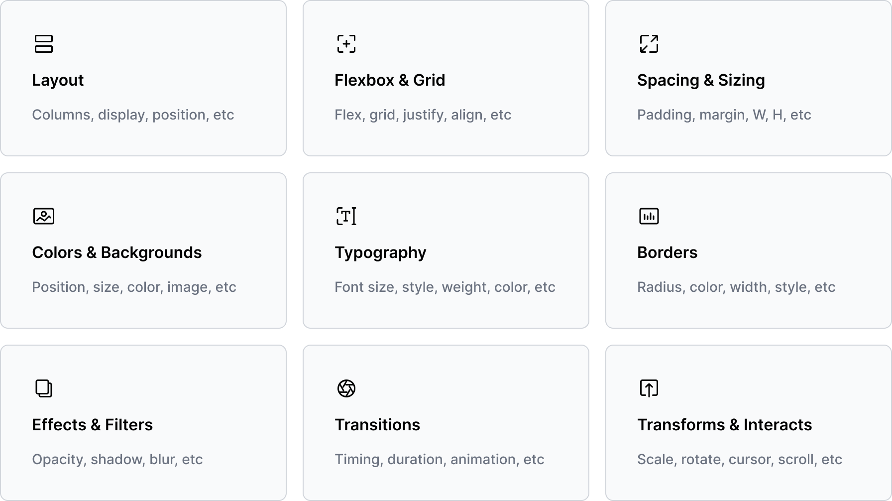
- Based on Atomic Design Principles, we used Tailwind as our sub-atomic utilities to construct the atomic-level elements (buttons, input fields, labels, etc).
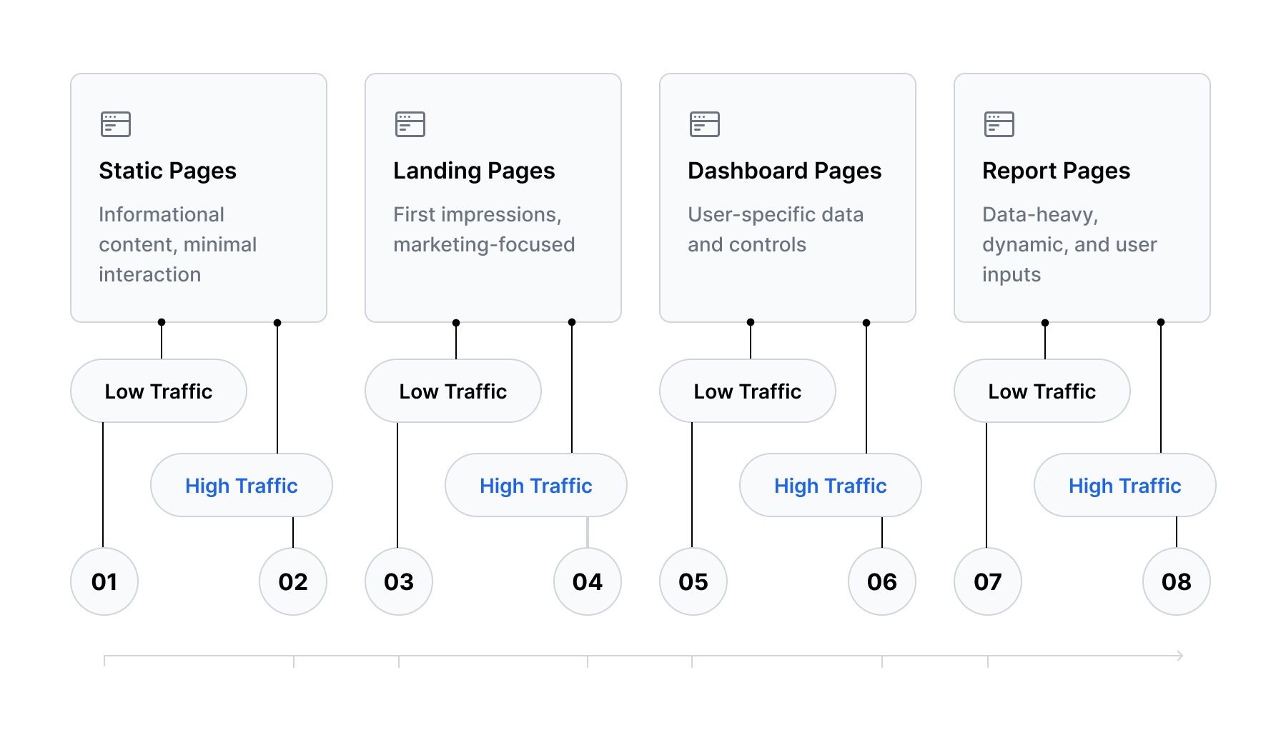
Development timeline approach
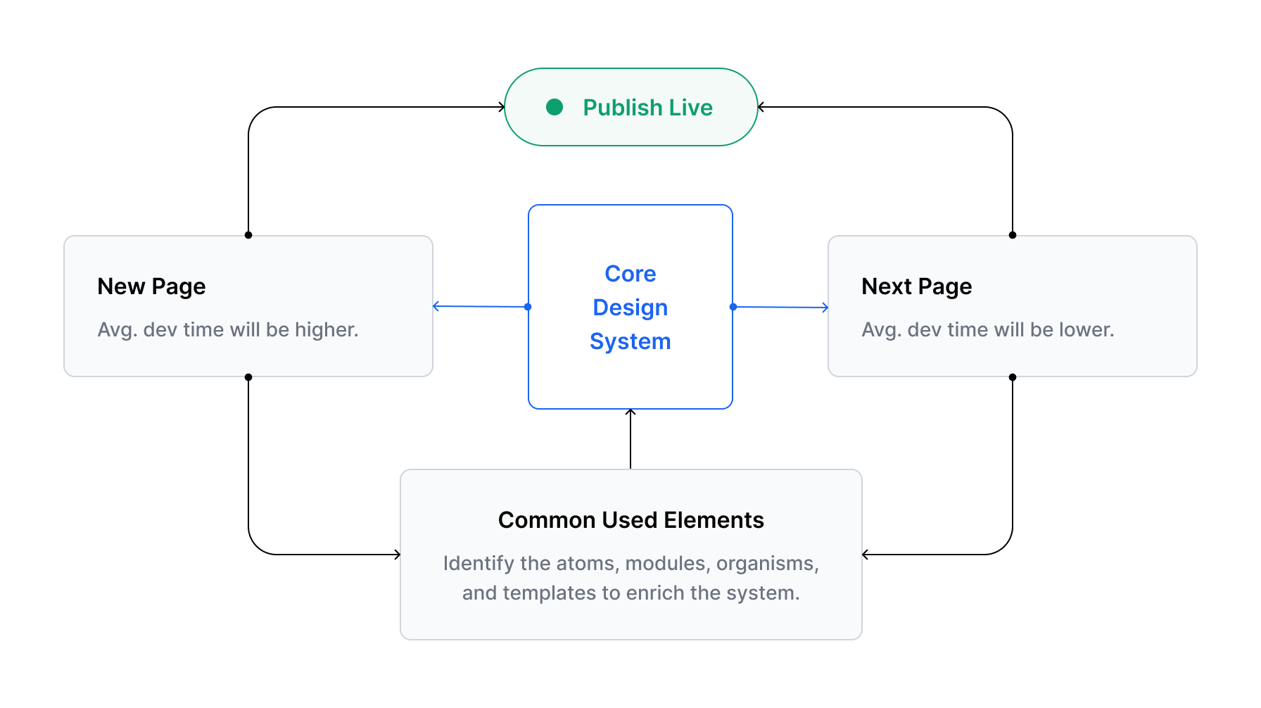
Core design system update process
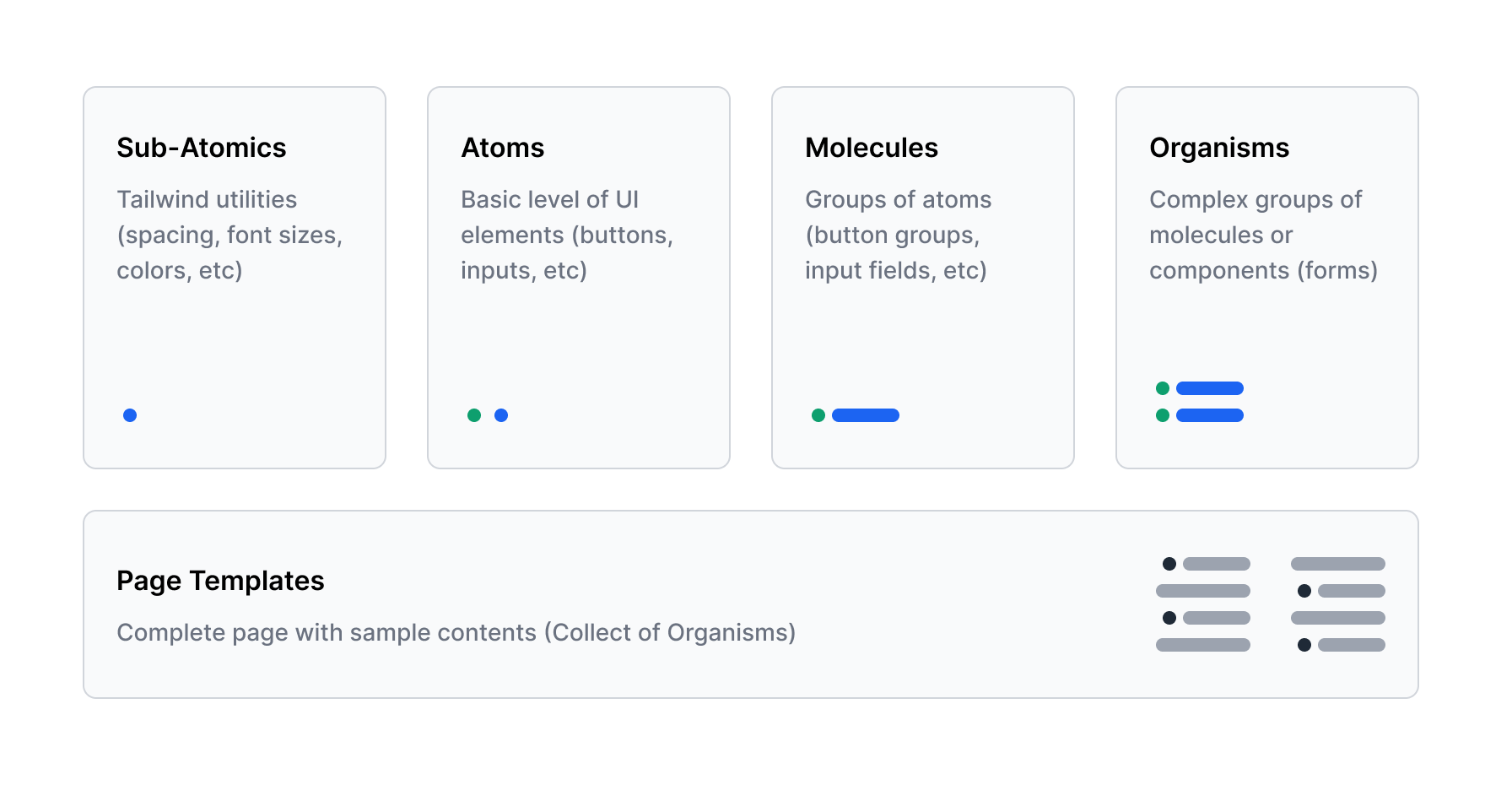
Atomic design structure
The Process
Level 01 - Sub-Atomics
Sub-Atomics directly came from the Tailwind primitive utilities, except for our brand colors. To make life easy for developers and designers, we have adopted Tailwind's naming conventions.
Often the biggest challenge when working with a framework is figuring out what you're supposed to do when there's something you need that the framework doesn't handle for you.
Tailwind has been designed from the ground up to be extensible and customisable, so with “tailwind.config.js” file, we can introduce our own customisations when necessary.
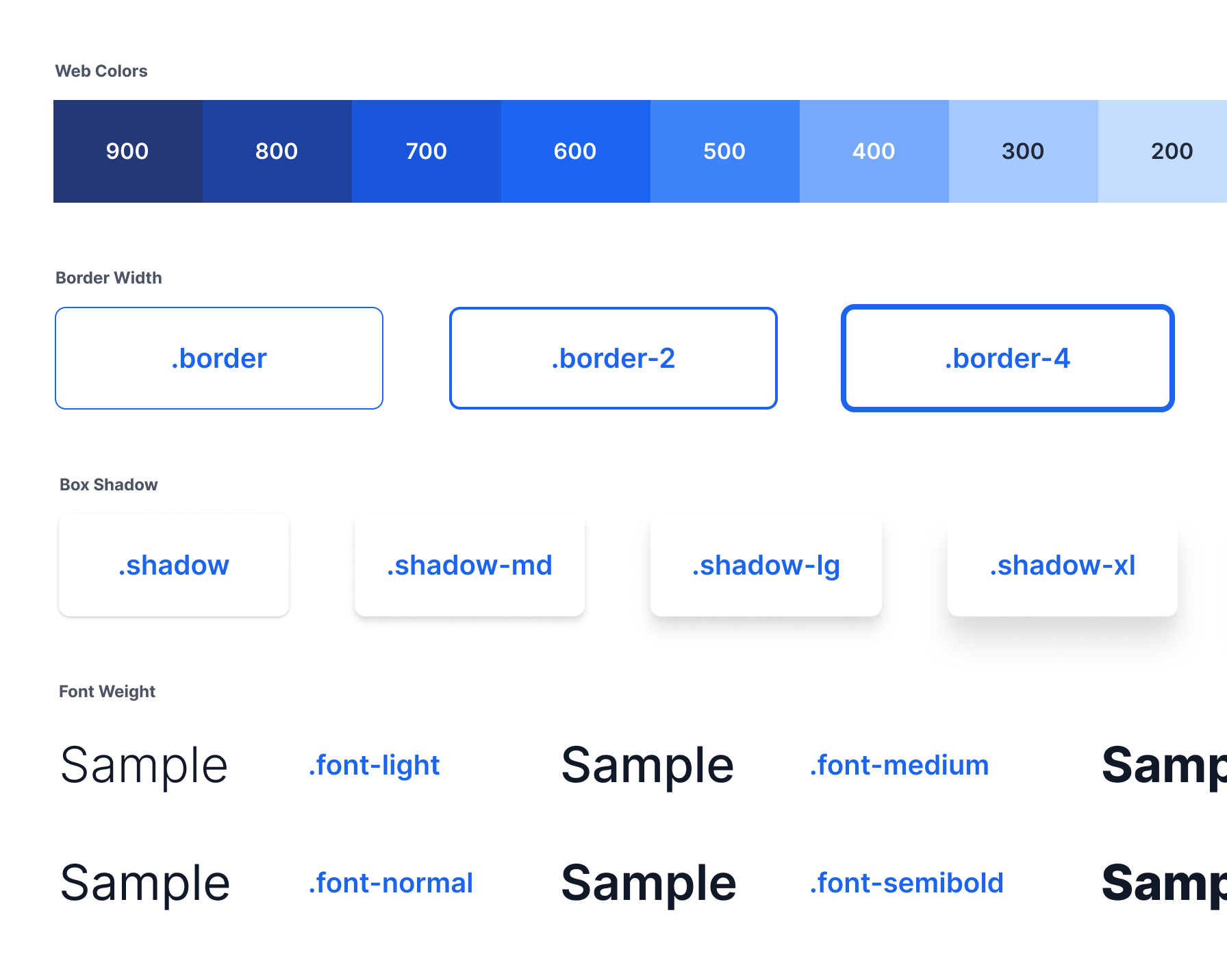
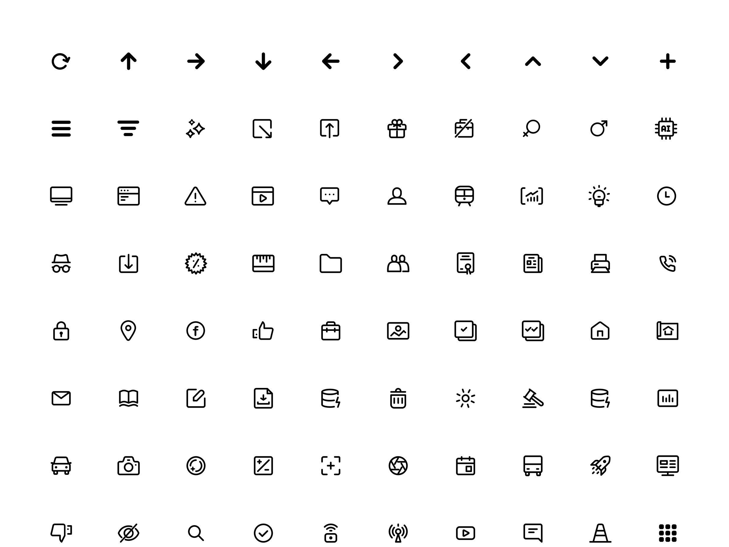
Tailwind utilities / samples
Tailwind primitive utilities
Level 02 - Atoms
Atoms, what we designed and developed from the ground up utilising Tailwind's primitive utilities. These Atomic Elements serve as the fundamental building blocks of our interface.
- At this level, we defined micro parameters like padding, gaps, shadows, etc. Fixed the ground level issues we found on our original system such as accessibility issues.
- We documented all the necessary parameters and design guides with in the Figma file.
- Made a simple interface inventory and built variations on all the use cases to ensure consistency across the system.
- Maintained a simple documentation and a changelog for track the dev updates.
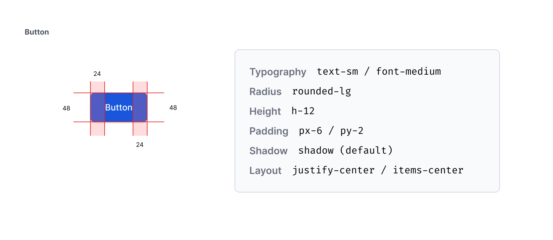
Design documentation / button / parameters
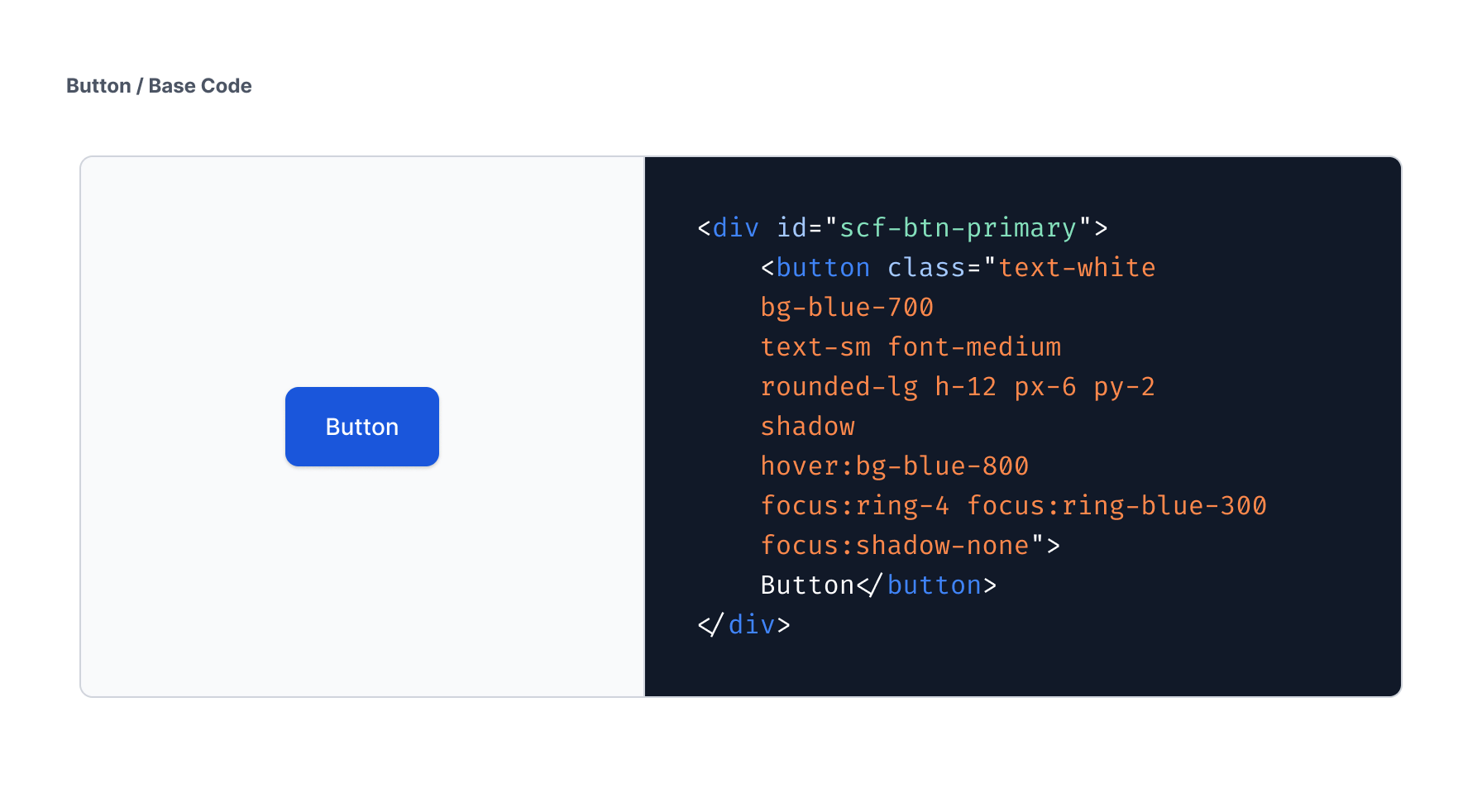
Front-end base code / button
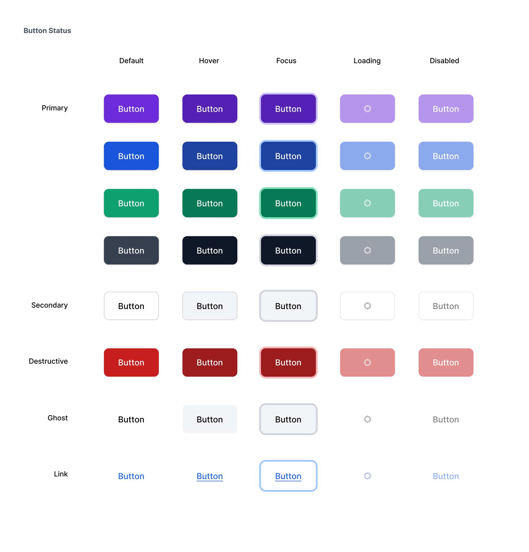
Categorisation and status / button
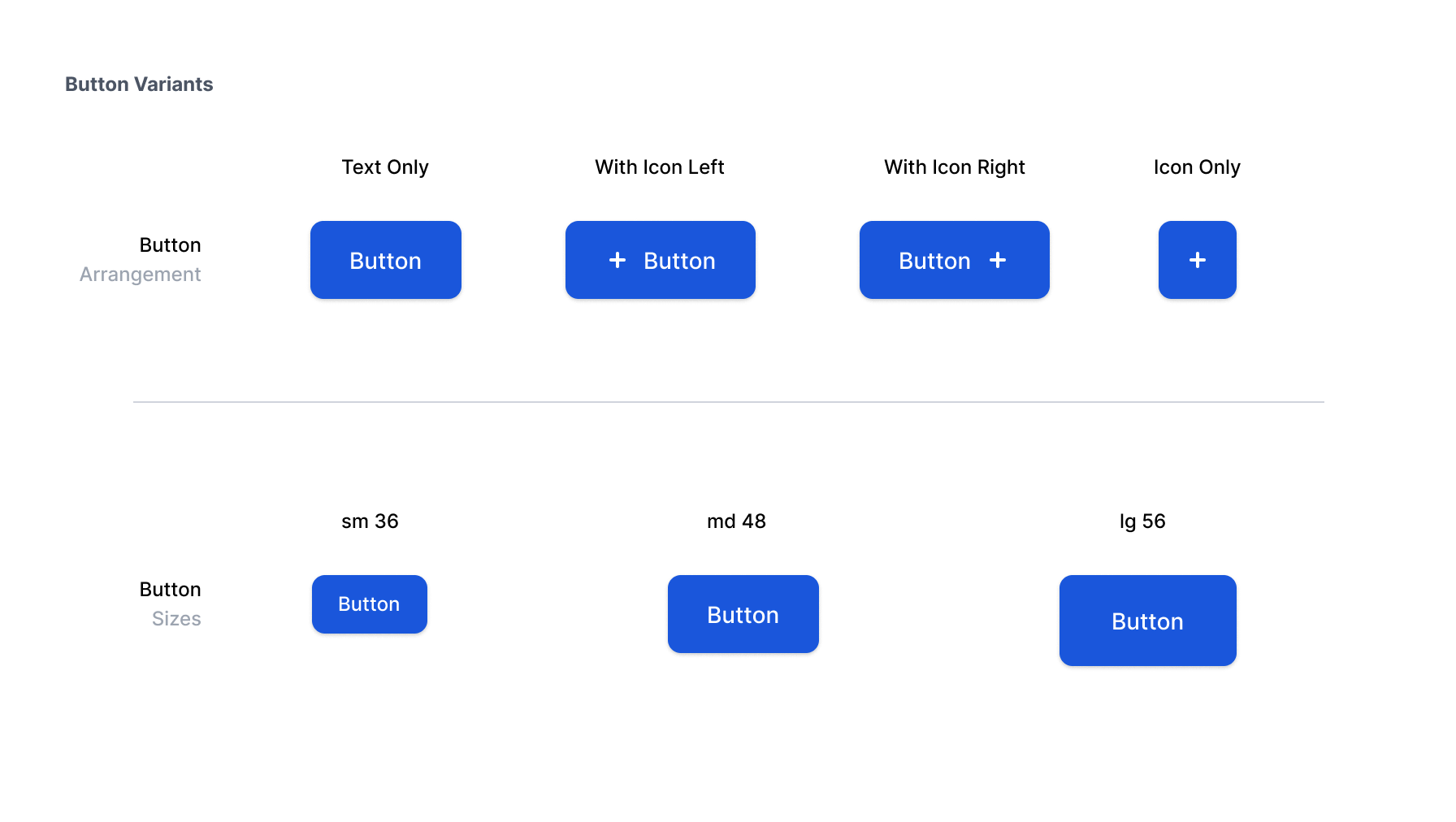
Variations / button
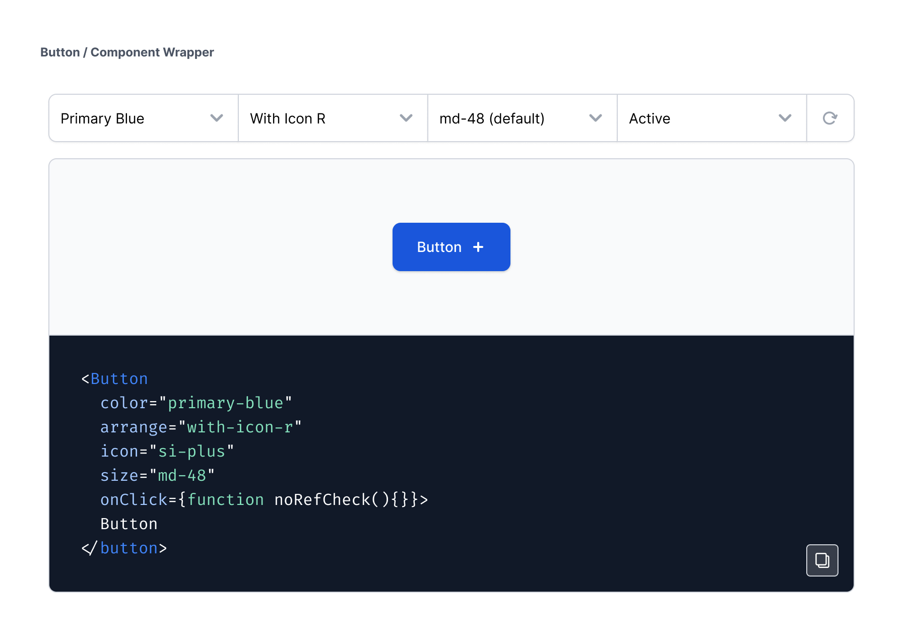
Component wrapper / npm style module / button
Level 03 - Molecules
Molecules consist of collections of Atoms that, when combined with various interactions, enable the execution of single or multiple tasks. These Molecule components create compact, functional UI elements such as search bars, pagination controls, and more.
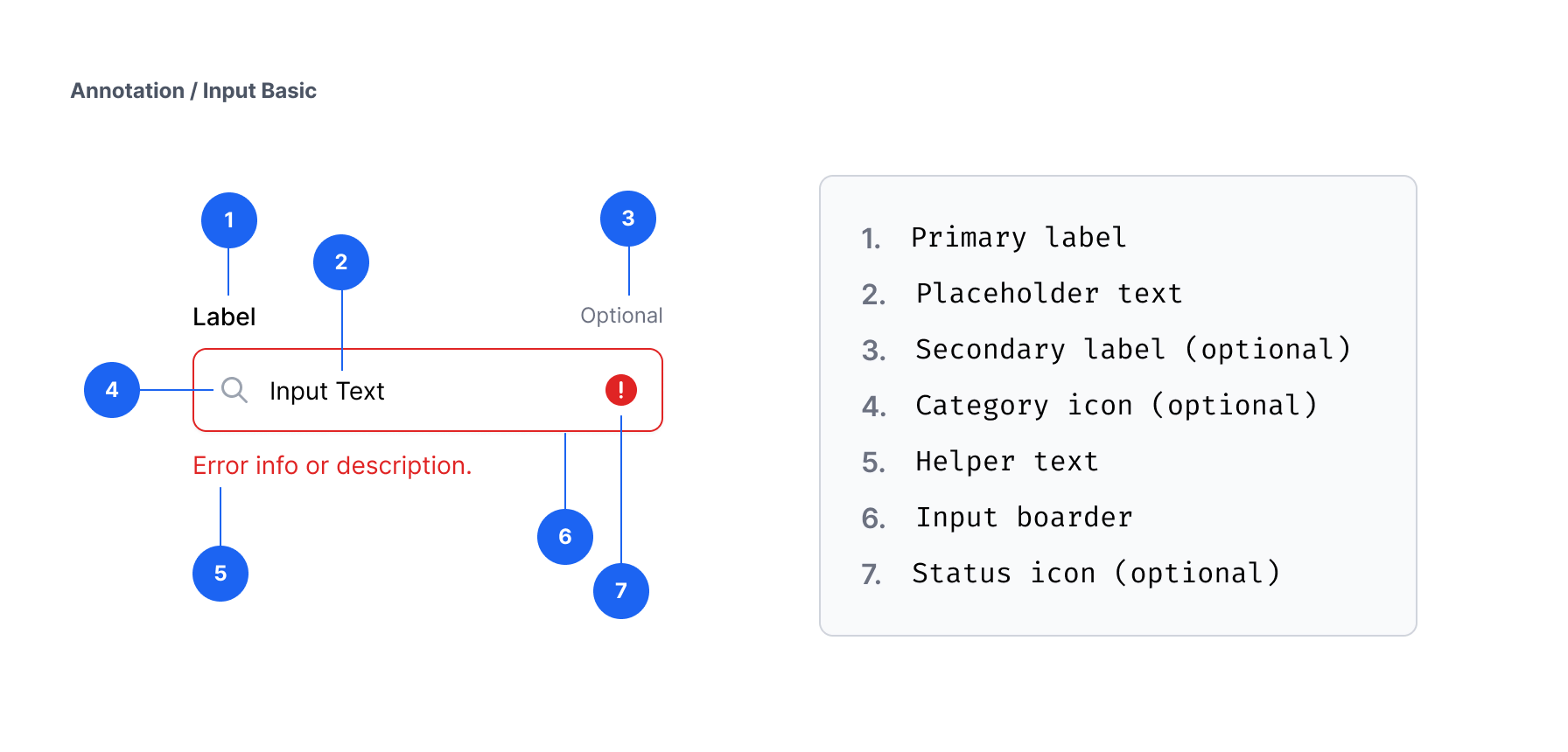
Design documentation / Input / annotation
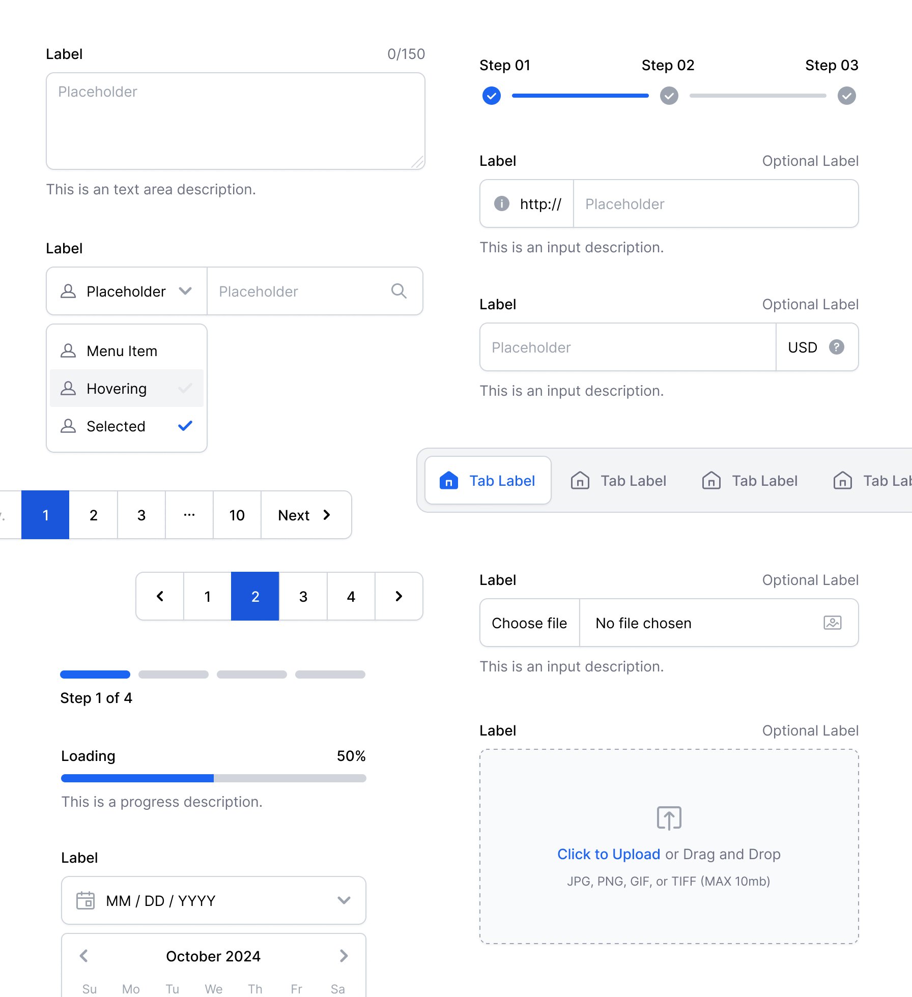
Molecule elements / samples
Level 04 - Organisms
Organisms are intricate assemblies of Molecules and Atoms. These Organisms create distinct components of an interface, including elements such as contact forms, header bars, review cards, and additional features.

Organisms elements / samples
Level 05 - Templates
Templates are the final layouts that define how organisms are arranged within a page, demonstrating the underlying content structure such as home page, contact us page, and more.

Landing page template / samples
Brand Assets - Icons & Illustrations
In parallel with the component library we developed, our own icon font called Scficons, also a vector-based illustration pack, a customizable illustration system, and a collection of Lottie JSON animations.
Sample preview of icon font

Illustration collection / Illustration system
Lottie JSON animations / samples
What We Learned
Success Factors
- Cleaner, crispy, consistent UI, and 20% faster avg. page load times.
- Developers reused components more often, which reduced duplicated code by almost 70%.
- Reduced the average development time for a new page by 30-35% within 3 months.
- Using icon fonts and SVG illustrations/animations makes our pages super light and easy to load.
- Gradual integration allowed us to evolve without halting progress.
- Designs are almost identical to the live version, due to the strong foundation and guideline.
What Didn't Work
- Design system is an ongoing project. Keeping everyone in the loop about how it works and importance of documentation will really pay off in the long run.
- Our documentation could include more practical examples, such as dos and don'ts.
- We're evaluating tools to help automate design-to-code handoffs and documentation.
- We should invest earlier in tools, such as Storybook, for shared visibility and ease of use.